Category

Category: CSS3 and HTML5

Responsive Table Using Pure CSS

There are many types of tables on websites where content can vary as wildly as the approaches used to make them responsive. There are really no comprehensive CSS based solution for making a table responsive.

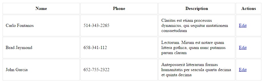
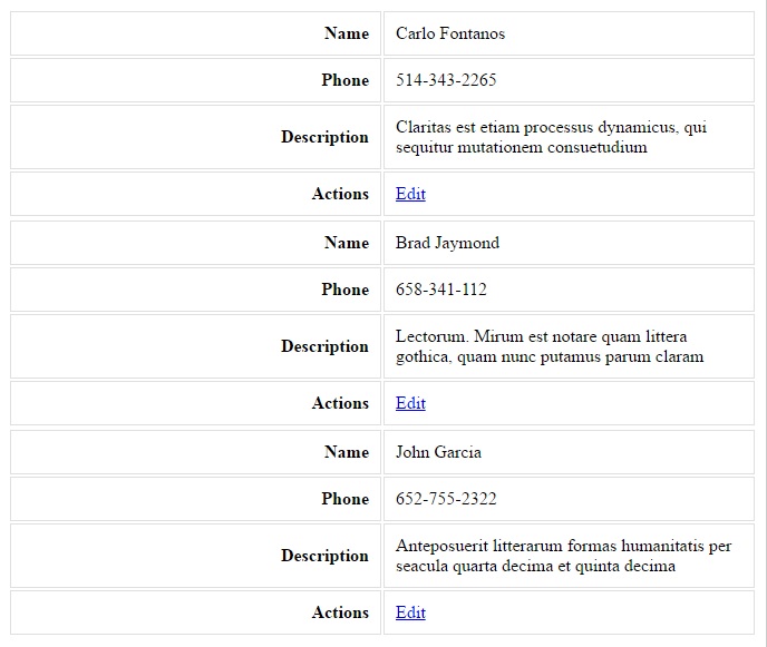
I set out to find a flexible and simple solution that could work as a reusable web component, regardless of the content within. See bellow:

Demo:


The Code:

@media only screen and (max-width: 768px) {	
	.override .res-tbl { border: 0; border-collapse: collapse;  }
	.override .res-tbl, .override .res-tbl thead, .override .res-tbl tbody, .override .res-tbl th, .override .res-tbl td, .override .res-tbl tr { display: block;  }
	.override .res-tbl thead tr { position: absolute; top: -9999px; left: -9999px; overflow: hidden;  }
	.override .res-tbl tbody tr { margin: 0 0 15px 0; display: flex; flex-flow: column; border: 1px solid #ddd; border-bottom: 0;  }
	.override .res-tbl tbody tr:nth-child(odd) { }
	.override .res-tbl tbody tr:nth-child(even) { }
	.override .res-tbl tr td { border-top: none; border-left: none; border-right: none; border-bottom: 1px solid #ddd; position: relative; padding-left: 40%; word-wrap: break-word; }
	.override .res-tbl tr td: last-child { border-bottom: none;  }
	​.override .res-tbl tr td:first-child { border-top: 1px solid #ddd;  }
	.override .res-tbl td:before { position: absolute; top: 6px; left: 6px; width: 55%; padding-right: 10px; white-space: nowrap; content: attr(data-label); text-align: left;  }
}

Breaking point starts at 768px, you can change it to any value you want. Also notice we’re using a “.override” class which we have add to our body element as <body class=”override”>  to give our CSS more priority therefore allowing override without having to use “!important” attribute in every CSS property we define.

Example Usage with Bootstrap Table:

<!DOCTYPE html>
<html lang="en">
<head>
	<title>Bootstrap Example</title>
	<meta charset="utf-8">
	<meta name="viewport" content="width=device-width, initial-scale=1">
	<link rel="stylesheet" href="https://maxcdn.bootstrapcdn.com/bootstrap/3.3.7/css/bootstrap.min.css">
	<link rel="stylesheet" href="styles.css"> <!-- Create this file then add our responsive table overrides in it. --?
	<script src="https://ajax.googleapis.com/ajax/libs/jquery/3.3.1/jquery.min.js"></script>
	<script src="https://maxcdn.bootstrapcdn.com/bootstrap/3.3.7/js/bootstrap.min.js"></script>
</head>
<body class="override">

<div class="container">
	<h2>Basic Table</h2>
	<p>The .table class adds basic styling (light padding and only horizontal dividers) to a table:</p>            
	<table class="table table-bordered table-striped res-tbl">
		<thead>
			<tr>
				<th>Firstname</th>
				<th>Lastname</th>
				<th>Email</th>
				<th>Email</th>
				<th>Email</th>
				<th>Email</th>
				<th>Action</th>
			</tr>
		</thead>
		<tbody>
			<tr>
				<td data-label="Firstname">John</td>
				<td data-label="Lastname">Doe</td>
				<td data-label="Email">john@example.com</td>
				<td data-label="Email">john@example.com</td>
				<td data-label="Email">john@example.com</td>
				<td data-label="Email">john@example.com</td>
				<td data-label="Action"><button class="btn btn-default">Edit User</button></td>
			</tr>
			<tr>
				<td data-label="Firstname">Mary</td>
				<td data-label="Lastname">Moe</td>
				<td data-label="Email">mary@example.com</td>
				<td data-label="Email">mary@example.com</td>
				<td data-label="Email">mary@example.com</td>
				<td data-label="Email">mary@example.com</td>
				<td data-label="Action"><button class="btn btn-default">Edit User</button></td>
			</tr>
			<tr>
				<td data-label="Firstname">July</td>
				<td data-label="Lastname">Dooley</td>
				<td data-label="Email">july@example.com</td>
				<td data-label="Email">july@example.com</td>
				<td data-label="Email">july@example.com</td>
				<td data-label="Email">july@example.com</td>
				<td data-label="Action"><button class="btn btn-default">Edit User</button></td>
			</tr>
		</tbody>
	</table>
</div>

</body>
</html>


Get a Perfect Score of 100 on Google PageSpeed Insights

Recently, I was exploring on how to get a perfect score of 100 on Google PageSpeed Insights. I searched for days and did several trial and errors, finally I was able to get my static page to score 100. Bellow are some tips on how I was able to do it.

Checkout Demo site   Run Demo site on PageSpeed Insights

  • Use CDN – This allow users from a around the world to download static content from a closer source instead of spanning the Atlantic ocean to retrieve data.
  • Compress your JS, CSS, Images and HTML. The more compressed you get your scripts / images, the faster the download will be.
  • Get a faster hosting. Google also rank sites base on the amount of time spent to deliver your content to readers. According to Google, users tend to leave sites that take more than 3 seconds to load. So it’s important to to pick the right hosting for your website. Tip: new hosting sites are usually better because their servers are less crowded.
  • Leverage browser caching. I always use the following config to enable caching for specific types of file.
    ExpiresActive On
    ExpiresByType image/jpg "access 1 year"
    ExpiresByType image/jpeg "access 1 year"
    ExpiresByType image/gif "access 1 year"
    ExpiresByType image/png "access 1 year"
    ExpiresByType text/css "access 1 month"
    ExpiresByType text/html "access 1 month"
    ExpiresByType application/pdf "access 1 month"
    ExpiresByType text/x-javascript "access 1 month"
    ExpiresByType application/x-shockwave-flash "access 1 month"
    ExpiresByType image/x-icon "access 1 year"
    ExpiresDefault "access 1 month"
    
  • Enable Gzip Compression – Gzip Compression allows your web server to provide smaller file sizes which load faster for your website users. The code below should be added to your .htaccess file.
    mod_gzip_on Yes
    mod_gzip_dechunk Yes
    mod_gzip_item_include file .(html?|txt|css|js|php|pl)$
    mod_gzip_item_include handler ^cgi-script$
    mod_gzip_item_include mime ^text/.*
    mod_gzip_item_include mime ^application/x-javascript.*
    mod_gzip_item_exclude mime ^image/.*
    mod_gzip_item_exclude rspheader ^Content-Encoding:.*gzip.*
    

    The code above will work on Apache. If it’s not working there is another way that may work for you. Remove the above code from your .htaccess file and try this one instead:

    AddOutputFilterByType DEFLATE text/plain
    AddOutputFilterByType DEFLATE text/html
    AddOutputFilterByType DEFLATE text/xml
    AddOutputFilterByType DEFLATE text/css
    AddOutputFilterByType DEFLATE application/xml
    AddOutputFilterByType DEFLATE application/xhtml+xml
    AddOutputFilterByType DEFLATE application/rss+xml
    AddOutputFilterByType DEFLATE application/javascript
    AddOutputFilterByType DEFLATE application/x-javascript
    

    In my experience, enabling Gzip Compression gives you most of the score difference on Google PageSpeed Insights.

  • Get rid of render blocking scripts.
    • If you put your scripts within the head tag of your HTML –  the page will have to wait for the css and js to finish loading before it starts rendering your content. The best approach I found is to append css and js scripts dynamically to the header tag and in the end of body tag, that is – after DOM has completed loading.  You can get the script here: https://gist.github.com/carlo-fontanos/abc69dfea9d1e853c0e49fe509dbaa4b
    • Note that the loadScript()  and loadStyle()  loads the files asynchronously so if you have scripts that are depending on another script, ex. jQuery, then you should nest them like this:.
      loadScript("js/script1.js", function(){
      	loadScript("js/script2.js", function(){
      		loadScript("js/script3.js", function(){
      			loadScript("js/script4.js", function(){
      				loadScript("js/script5.js", function(){});
      			});
      		});
      	});
      });
      
    • Observation: when you refresh your page you will notice that it loads an unstyled HTML for a few seconds then renders back properly after your critical stylesheets have been fully loaded – uhh.. that’s ugly. Let’s fix that!  Within the head tag of your HTML (right after your meta tags), add the following styles:
      <style id="init-style">
      *{color:#fff; border:0; background:none;} 
      img,button{display:none;}
      </style>
    • The CSS code above TEMPORARILY sets all the elements to appear white and all images removed. Basically we are trying to make the screen appear like it’s still trying to load the content when actually the content is already there, but just not visible yet.
    • If you look at the <styles>  tag, it has an ID “init-style” – this will help us easily identify and remove it when all our critical css files have been fully loaded. So for example, we need to load a critical css file such as bootstrap: 1st is we load bootstrap dynamically, then 2nd we remove the initial styles from the header tag right after. Like this:
      loadStyle("//maxcdn.bootstrapcdn.com/bootstrap/4.0.0-alpha.6/css/bootstrap.min.css", function(){
      	document.getElementById("init-style").outerHTML=''; /* Remove initial styles from your page */
      });			
      
  • Combine CSS Files. Fewer HTTP requests for CSS content is better rather than loading a bunch individual CSS files. You can use this PHP script to combine multiple CSS files into a single file then compress it on-the-fly: https://gist.github.com/carlo-fontanos/f2ab6afaa71f29595b3f0d95f40ad2b0

I see a lot of posts complaining about scripts like Google Analytics being a render blocker. Well, if Google is cheating on you, you can cheat Google back:

This is the user-agent for pageSpeed:

“Mozilla/5.0 (X11; Linux x86_64) AppleWebKit/536.8 (KHTML, like Gecko; Google Page Speed Insights) Chrome/19.0.1084.36 Safari/536.8”

You can insert a conditional to avoid serving the analytics script to PageSpeed:

<?php if (!isset($_SERVER['HTTP_USER_AGENT']) || stripos($_SERVER['HTTP_USER_AGENT'], 'Speed Insights') === false): ?>
	/* your analytics code here or any HTML element you want ignored by PageSpeed Insights */ 
<?php endif; ?>

or via Javascript:

if(navigator.userAgent.indexOf("Speed Insights") == -1) { 
	/* your analytics code here or any HTML element you want ignored by PageSpeed Insights */
}

If your only concern is getting a 100/100 score this will do it.

Create a Facebook Preloader Style using Bootstrap

CSS3 is just awesome, the development is fast and the possibilities are endless. Today I want to show you how you can make an awesome Facebook-like preloader animation using just HTML, CSS and Boostrap grids. This tutorial is so much easier to implement as compared to how other developers code it, plus you get to leverage bootstrap grids, so you no longer have to worry about the responsiveness of your preloader.

Demo

 
The image above can be coded as simple as this:

1
2
3
4
5
6
7
8
9
10
11
12
13
14
15
16
17
18
19
20
21
22
23
24
25
26
27
28
29
30
31
32
33
34
35
36
37
38
39
40
41
42
43
44
45
46
47
48
49
50
51
52
53
54
55
56
57
58
59
60
61
62
63
64
65
66
67
68
69
70
71
72
73
74
75
76
<div class="container">
    <div class="col-sm-3">
        <div class="panel panel-default">
            <div class="panel-heading clearfix">
                <div class="col-xs-10">
                    <div class="animate-bg"></div>
                </div>
            </div>
            <div class="panel-body">
                <div class="col-sm-5">
                    <p class="animate-bg"><br><br><br></p>
                </div>
                <div class="col-sm-7">
                    <p class="animate-bg"></p>
                    <p class="animate-bg col-sm-11"></p>
                    <p class="animate-bg"></p>
                </div>
            </div>
        </div>
    </div>
   
    <div class="col-sm-9">
        <div class="panel panel-default">
            <div class="panel-heading clearfix">
                <div class="col-xs-10">
                    <div class="animate-bg"></div>
                </div>
            </div>
            <div class="panel-body">
                <div class="clearfix">
                    <div class="col-sm-3">
                        <p class="animate-bg"><br><br><br><br><br><br></p>
                    </div>
                    <div class="col-sm-9">
                        <p class="animate-bg col-sm-11"></p>
                        <p class="animate-bg col-sm-9"></p>
                        <p class="animate-bg col-sm-10"></p>
                        <p class="animate-bg col-sm-9"></p>
                        <p class="animate-bg"></p>
                    </div>
                </div>
               
                <br>
               
                <div class="col-sm-6">
                    <p class="animate-bg col-sm-11"></p>
                    <p class="animate-bg col-sm-9"></p>
                    <p class="animate-bg col-sm-10"></p>
                    <p class="animate-bg col-sm-9"></p>
                    <p class="animate-bg"></p>
                </div>
                <div class="col-sm-6">
                    <p class="animate-bg"><br><br><br><br><br><br></p>
                </div>
            </div>
        </div>
    </div>
</div>

How to make your Tables Responsive

Recently I was working on an HTML table with a lot of columns, I thought “How is this going to look on my mobile phone?”. So then I searched for “responsive tables” and found Stackable.JS. The purpose of Stackable.JS is to give you an easy way of converting wide tables to a format that will work better on small screens. It creates a copy of the table that is converted into a 2-column key/value format.

Demo


How does it work?

On the demo, I used the cardtable method. Card table breaks each row into its own table. The row tables function like cards. Any content left in tfoot is also broken into its own card, this allows for things like view all links or pagination to be easily used.

Original:

stackable-js-demo-full-width

When screen hits 768px and bellow:

stackable-js-demo-stacked-at-768px

The Code

Simply copy the entire code to a html file then run it.

1
2
3
4
5
6
7
8
9
10
11
12
13
14
15
16
17
18
19
20
21
22
23
24
25
26
27
28
29
30
31
32
33
34
35
36
37
38
39
40
41
42
43
44
45
46
47
48
49
50
51
52
53
54
55
56
57
58
59
60
61
<!DOCTYPE html>
<html lang="en">
<head>
    <style>
    .stacktable { width: 100%; }
    .stacktable tr td, .stacktable tr th { border: 1px solid #dfdfdf; padding: 10px; }
    .st-head-row { padding-top: 1em; }
    .st-head-row.st-head-row-main { font-size: 1.5em; padding-top: 0; }
    .st-key { width: 49%; text-align: right; padding-right: 1%; font-weight: bold; }
    .st-val { width: 49%; padding-left: 1%; }
   
    .stacktable.large-only { display: table; }
    .stacktable.small-only { display: none; }

    @media (max-width: 768px) {
        .stacktable.large-only { display: none; }
        .stacktable.small-only { display: table; }
    }
    </style>
</head>
<body>
    <table id="make-responsive" class="table" width = "100%">
        <thead>
            <tr>
                <th width="30%">Name</th>
                <th width="30%">Phone</th>
                <th width="30%">Description</th>
                <th width="10%">Actions</th>
            </tr>
        </thead>
        <tbody>
            <tr>
                <td>Carlo Fontanos</td>
                <td>514-343-2265</td>
                <td>Claritas est etiam processus dynamicus, qui sequitur mutationem consuetudium</td>
                <td><a href="#">Edit</a></td>
            </tr>
            <tr>
                <td>Brad Jaymond</td>
                <td>658-341-112</td>
                <td>Lectorum. Mirum est notare quam littera gothica, quam nunc putamus parum claram</td>
                <td><a href="#">Edit</a></td>
            </tr>
            <tr>
                <td>John Garcia</td>
                <td>652-755-2322</td>
                <td>Anteposuerit litterarum formas humanitatis per seacula quarta decima et quinta decima</td>
                <td><a href="#">Edit</a></td>
            </tr>
        </tbody>
    </table>

    <script src="//ajax.googleapis.com/ajax/libs/jquery/1.7.0/jquery.min.js"></script>
    <script src="https://files-stackablejs.netdna-ssl.com/stacktable.min.js" type="text/javascript"></script>

    <script>
        $('#make-responsive').cardtable();
    </script>

</body>
</html>

Flat Surface Shader Tutorial

flat-surface-shader-image-sample

Demo

The Flat Surface Shader is a simple plugin developed by Matthew Wagerfield which is based on the Lambertian Reflectance model, where the color of a triangle is calculated by a variety of different light sources within a particular scene. It is a great alternative to creating 3d effects with WebGL. Basically, this cool toy takes geometry, light and triangles and turns it into something fun, exciting and beautiful that everyone can use. With this Flat Surface Shader, triangles are rendered into three different contexts (WebGL, Canvas 2D and SVG). You can customize the settings yourself and even export your finished piece of art as a SVG or a PNG graphic that you can use later. What makes this project even better is that it is open source. You can visit their website, have a look at the code yourself and you can even adapt it or make it better if you want to. Reference

On the Demo, I rendered FSS using a Canvas.

The Code

1
2
3
4
5
6
7
8
9
10
11
12
13
14
15
16
17
18
19
20
21
22
23
24
25
26
27
28
29
30
31
MESH: {
    ambient: '#555555', // Default
    diffuse: '#FFFFFF', // Default
    width: 1.2, // Triangle Width
    height: 1.2, // Triangle Height
    depth: 10, // Transparency of the triangles
    segments: 16, // Number of triangles to display in 1 row
    slices: 8, // Number of triangles to display in 1 column
    xRange: 0.8, // Wideness of the triangles in X Position
    yRange: 0.1, // Wideness of the triangles in Y Position
    zRange: 1.0, // Wideness of the triangles in Z Position
    speed: 0.002 // Speed of the moving traingles
},

LIGHT: {
    autopilot: true, // Set this to true if you want the light to follow your mouse cursor
    ambient: '#880066',
    diffuse: '#ff8800',
    count: 2, // Contrast
    zOffset: 100,
   
    xyScalar: 1,
    speed: 0.001,
    gravity: 1200,
    dampening: 0.15,
    minLimit: 8,
    maxLimit: null,
    minDistance: 20,
    maxDistance: 400,
    draw: false // Set to true if you want to just draw a background image (static).
}

You Configure it live @ http://matthew.wagerfield.com/flat-surface-shader/ refer to the screenshot bellow

flat-surface-editor

Another cool example that I saw from CodePen is an Earth Figure with FSS used on the water: codepen.io/Yuschick/pen/tbiHp

Select Box with Search Filter

Turn a simple Select box:

ugly-select

Into this:

nice-select

Supported in:

  • IE 8+
  • Chrome 8+
  • Firefox 10+
  • Safari 3+
  • Opera 10.6+

Download the latest plugin here: Download

The idea
Select2 hides the old select box(inlined “display: none;”) and replicates it with a new custom select box structure. It ads a “s2id_” before the name of your select box ID. All options within the old select box are inherited by the new select box.

Sample usage:

1
2
3
4
5
6
7
8
9
10
11
12
13
14
<head>
    <link href="select2.css" rel="stylesheet"/>
    <script src="select2.js"></script>
    <script>
        $(document).ready(function() { $("#education").select2(); });
    </script>
</head>
<body>
    <select id="education">
        <option value="AD">Associates Degree</option>
        ...
        <option value="BD">Bachelors Degree</option>
    </select>
</body>

Commonly used parameters:

placeholder [string] Placeholder for the select element
allowClear [boolean] true or false. Default is false
minimumInputLength [int] Filters 2 string values

Usage:

1
2
3
4
5
$("#education").select2({
    placeholder: "Select an option",
    allowClear: true,
    minimumInputLength: 5
});

Reference Site: http://ivaynberg.github.io/select2/select2-latest.html

Contact Form 7 Normalize Form CSS

The CSS code bellow will give you a nice and simple appearance to your Contact 7 Forms

1
2
3
4
5
6
7
8
.wpcf7-form p {line-height: 30px;}
.wpcf7-form p input[type="text"], .wpcf7-form p input[type="email"], .wpcf7-form p textarea, .wpcf7-form p select{padding: 5px; border: 1px solid #DDDDDD;
/*Applying CSS3 gradient: */ background: -moz-linear-gradient(center top , #FFFFFF,  #EEEEEE 1px, #FFFFFF 20px); background: -webkit-gradient(linear, left top, left 20, from(#FFFFFF), color-stop(5%, #EEEEEE) to(#FFFFFF)); filter: progid:DXImageTransform.Microsoft.gradient(startColorstr='#FBFBFB', endColorstr='#FFFFFF');  
/*Applying CSS 3radius: */  -moz-border-radius: 3px; -webkit-border-radius: 3px; border-radius: 3px;
/*Applying CSS3 box shadow: */ -moz-box-shadow: 0 0 2px #DDDDDD; -webkit-box-shadow: 0 0 2px #DDDDDD; box-shadow: 0 0 2px #DDDDDD; width: 70%;}
.wpcf7-form p select{width: 72%;}
.wpcf7-form p input[type="text"]:hover, .wpcf7-form p input[type="email"]:hover, .wpcf7-form p textarea:hover, .wpcf7-form p select:hover{border:1px solid #cccccc;}
.wpcf7-form p input[type="text"]:focus, .wpcf7-form p input[type="email"]:focus, .wpcf7-form p textarea:focus, .wpcf7-form p select:focus{box-shadow:0 0 2px #FFFE00;}

Top CSS3 Image Effects

image-effect1

Demo Download Tutorial

Useful CSS3 Element Effects

pressit_blog_graphic